From Brain to Brand: The Science of Logo Design and Advertising
By Vladislava Genova
Hey Readers,
in the dynamic world of advertising, the logo plays an indispensable role in shaping a brand’s identity. This carefully crafted symbol not only encapsulates the very essence of the business but also stands as a visual testament to the brand’s soul. The primary mission of logos is to establish an unbreakable bond between the brand it represents and its clients. To achieve this, they must seamlessly weave in the brand’s values and services.
The logo’s design should be unique ensuring easy recognition of the brand and setting it apart from its competitors. Simplicity is the golden rule here. An easily remembered, straightforward design sticks into the minds of consumers and carries a universe of associations.
Just think about some of the most renowned brands like Nike, Mercedes-Benz, Audi, Coca-Cola, Pepsi, etc. Their logos alone hold entire worlds of experience.
Taking Advantage of Our Visual Perception in the Art of Logo Design
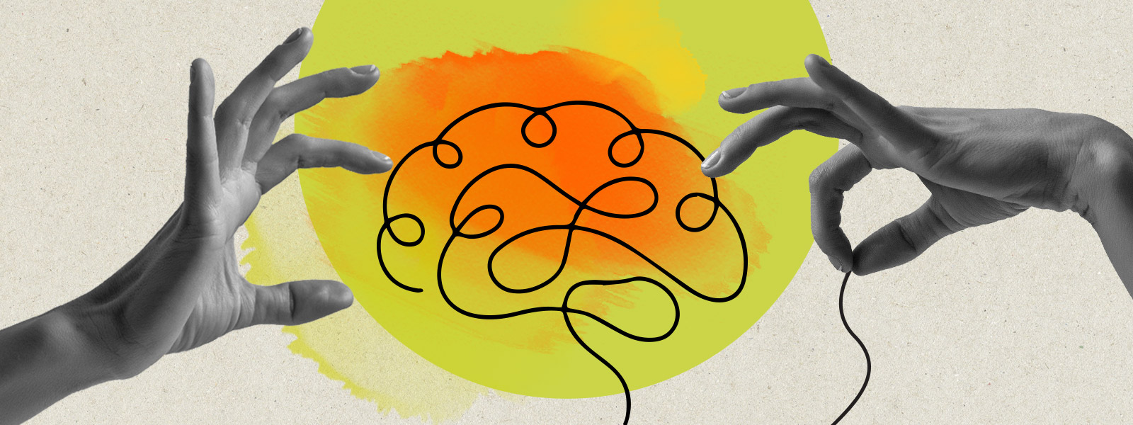
You might be wondering why the design of the logo has such significance. The key lies in our brain’s visual perception – how we observe and make sense of what we see.
The process of “seeing” begins when our eyes focus on an image. Neuronal signals then embark on a journey to the brain, where they are carefully processed to ensure accurate and clear perception. This is why all the elements of the logo should be carefully selected and logically arranged in one visual image.
Let’s explore why….
Gestalt Principles: “The Whole is Greater Than the Sum of Its Parts”
The Gestalt theory, a part of Psychology, describes six principles of perceptual organization that help us understand how our eyes and brain work together to see things. This theory tells us that our brain processes information in an organized and logical way.
Here they are:
Proximity: Our brain tends to group the elements that are close in time and space.
Similarity: When elements share similarities, our minds tend to perceive them as belonging together.
Closure: Our brain naturally completes incomplete figures, filling in the missing parts to create a whole image.
Common fate: The mind follows the direction of the elements, putting them into continuity
Figure–ground: We see figures as an object (figures) and a background (ground). Spoiler alert: We see first the object which is more important to us.
Simplicity (the Good Gestalt): The good Gestalt represents a concept of simplicity, characterized by symmetry and stability. It embodies the idea that it cannot be simplified further.
The Gestalt effect highlights our senses’ ability to recognize complete figures rather than separate lines and curves when viewing visual stimuli. Or, in other words, “The whole is greater than the sum of its parts.”
Another curious fact is that perception of the relationship between objects is subjective and it can be influenced since people tend to perceive the world predictably.
Understanding these basic principles is vital for designers. Many graphic designs are more impressive and effective because they use the Gestalt principles we talked about earlier. While all artists know that details matter, only a few of them succeed in connecting the different parts into a single striking image.
Logo Creation: How Does It All Come Together?
It is high time we took a look at how the witty application of Gestalt’s principles of perceptual organization empowers designers to create better logos.
The Principle of Proximity

Let’s take a closer look at the logo of “Mystery Island”. The creator did a brilliant job. In the composition of the elements, he used the proximity law to create the shape of an island and its reflection on the sea, using equalizer lines. The emblem is a harmonious fusion of the brand’s name and its essence as a dance music producer. Its symmetry along the vertical axis imparts a sense of balance, while the elements draw closely together, vividly encapsulating the brand’s ideology. A subtle yet powerful connection is established between the logo and the brand’s name, anchoring them as one. In addition, the choice of a monochrome palette of black and white signals a commitment to quality and professionalism that’s nothing short of striking.
You can notice the same idea in the logo of “Foodmobile”. In its design, you’ll notice that the elements are grouped closely together at the centre, creating a visually appealing composition filled with various fruits and vegetables. This arrangement follows the proximity law, making it easy to grasp the brand’s message. The logo is vibrant and playful, reflecting the wide range of food options the company offers.
The Principle of Similarity
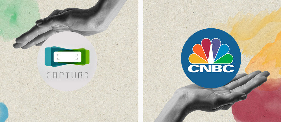
In the logo of “Capture”, the harmonious design emerges thanks to the repetition of colours, shapes, orientations, and forms. The deliberate recurrence of similar elements and colours creates a symmetrical composition where the horizontal and vertical axes mirror each other with impeccable precision.
The “CNBC” (Consumer News and Business Channel) logo is an iconic representation of the CNBC peacock. Again, you can notice the repetition of shapes.
The Principle of Figure-Ground
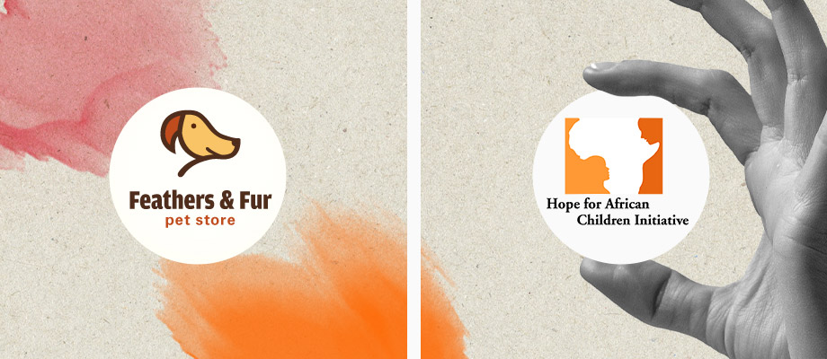
The designer of the “Feathers & Fur” pet store logo used the figure-ground principle to create this charming design. Within the logo, one can identify both a parrot and a dog. While the composition remains elegant and simple with minimalistic use of elements, it effectively communicates the company’s clear message: “Feathers & Fur” is a one-stop shop for our beloved pets offering a diverse range of products.
Have you seen the logo of the “Hope for Africa” charity campaign? Have you noticed that the continent of Africa serves as a backdrop, while a child gazes up at their mother? Once again, the composition embraces simplicity. It uses only two colours while the design brilliantly encapsulates the campaign’s core message – the urgent call for social awareness, emphasising that the children of Africa also require our help and care. The archetypal figures of the mother and child resonate powerfully, creating a universally recognizable image that everyone can connect to.
The Principle of Closure
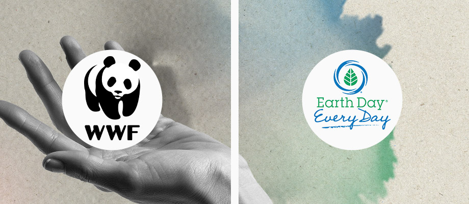
The “WWF Panda” logo is quite popular! Its secret ingredient? Glad you asked. The principle of closure makes the panda come to life before your eyes. The choice of the classic black-and-white palette isn’t just a coincidence. It is a perfect match for the organisation’s iconic symbol – the panda!
The Principle of Common Fate
This is the logo of the “Canada’s Earth Day” campaign. This powerful image conveys a profound message about the importance of environmental protection, emphasising the need for continuous care and vigilance throughout the year, rather than reserving our efforts for just one day during the whole year.
The Good Gestalt
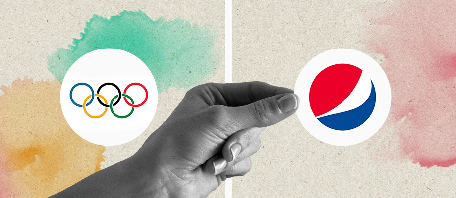
We are sure that you know the “Olympic Games” logo very well. It holds deep symbolism with its five interlaced rings, each representing one of the world’s continents. This design beautifully illustrates the diversity of athletes and nations coming together in the Olympic Games. It is a place where competitors from around the globe share a common sports spirit and the genuine desire to win through fair and honest competition.
The Principle of Symmetry
Here is the famous Pepsi logo! One of the most recognized logos globally. With its circular and symmetrical design, it keeps things balanced. As you can see, there are only three colours – blue, red, and white. The white separates the lively red from the cool blue. The blue represents the refreshing taste of the beverage, while the red adds the joy and excitement that one experiences when having a refreshing sip.
So, what do you think? Did you find this in-depth analysis of the intersection of Psychology and Advertising intriguing?
Do not forget to check out our services and how we can help you create your brand identity from scratch.